Open Sans is one of the most popular sans-serif font from the Google Font Library. Designed by Steve Matteson, Open Sans is available in 10 different styles ranging from light to extra bold. As Open Sans offers a simple yet clean and professional feel to the written text, it is widely used in web design projects.
In this article, we have selected 12 sans-serif fonts from the Google Font library that are similar to Open Sans and can be used as a replacement. All these sans-serif fonts are available in more than one weight and can be easily embedded in a website from Google Font. We have included a preview using the regular weight (400) for all the fonts listed below. To make it easier for you to compare them with Open Sans, we are including a similar preview for it:
Open Sans
by Steve Matteson available in 10 styles
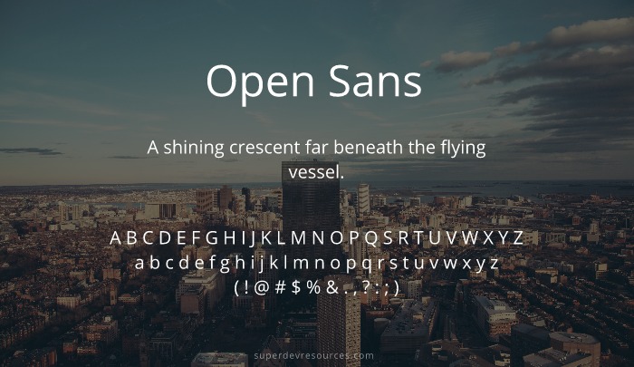
Free Open Sans Alternatives from Google Fonts
The Google Font library offers a large variety of fonts including serif, sans-serif, display, handwriting and mono-space. Open sans is a sans-serif font and thus we are listing below popular sans-serif fonts available from Google Fonts, which add similar professional and clean feel to the text. These fonts can work as an alternative when you are looking to replace the default system font or Open Sans in your design.
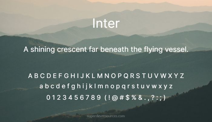
Inter
by Rasmus Andersson available in 9 styles
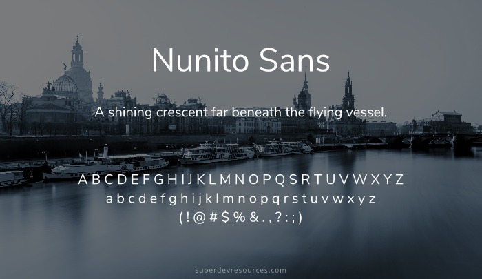
Nunito Sans
by Vernon Adams & Jacques Le Bailly available in 14 styles
Rubik
by Hubert and Fischer, Meir Sadan, Cyreal available in 14 styles

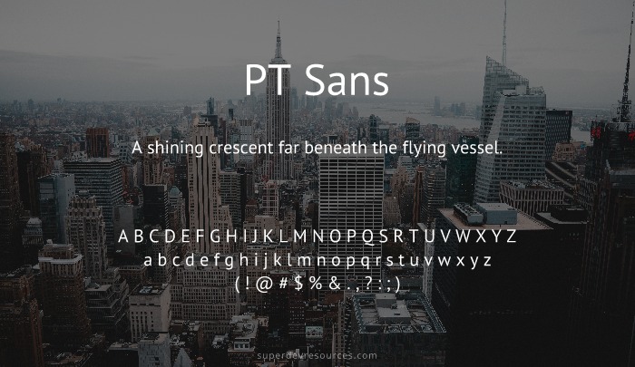
PT Sans
by ParaType available in 4 styles
Roboto
by Christian Robertson available in 12 styles

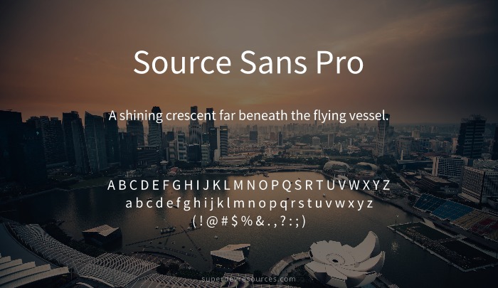
Source Sans Pro
by Paul D. Hunt available in 12 styles
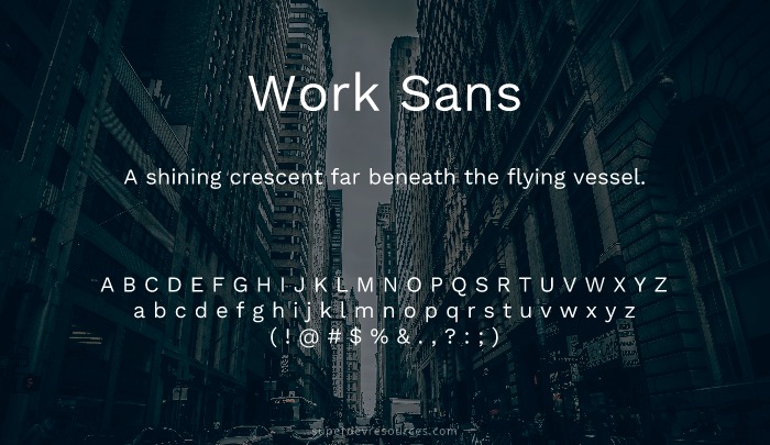
Work Sans
by Wei Huang available in 9 styles
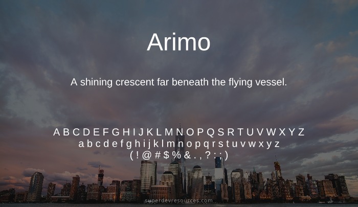
Arimo
by Steve Matteson available in 4 styles
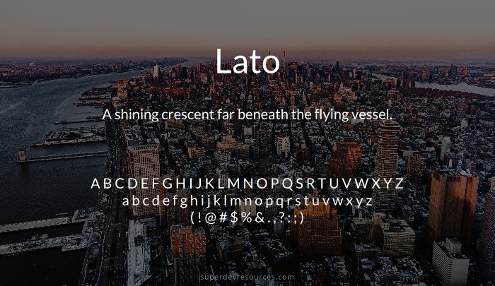
Lato
by Łukasz Dziedzic available in 10 styles
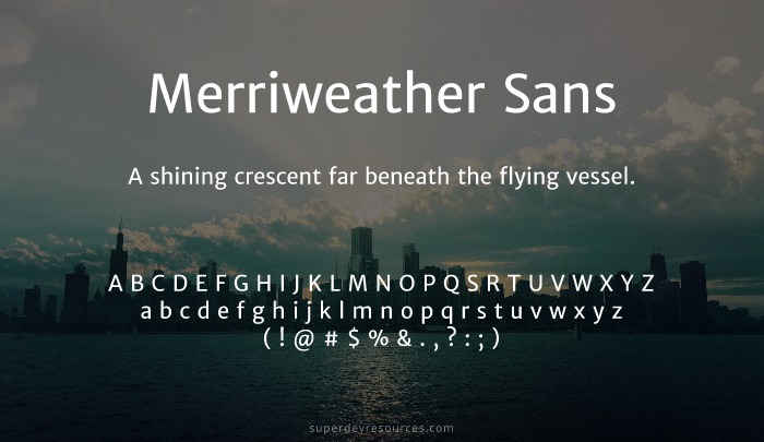
Merriweather Sans
by Sorkin Type available in 8 styles
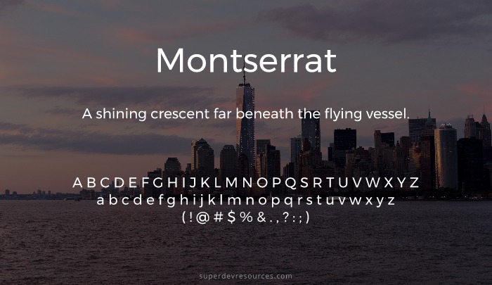
Montserrat
by Julieta Ulanovsky available in 18 styles
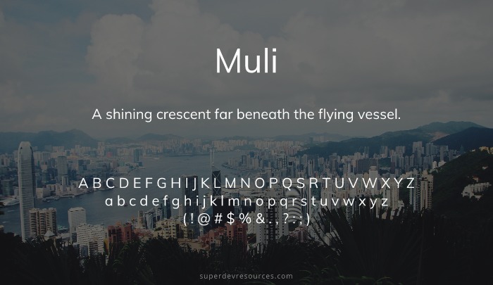
Muli
by Vernon Adams available in 10 styles
System Font Stack as Open Sans Alternative
If you don’t want to load an additional web font, then a default system font stack similar to the one given below can also be used in your CSS to provide a good reading experience to your website visitors. This font stack ensures that the default sans-serif font available on different devices is automatically picked and used to render the text of your website.
body {
  font-family: -apple-system,system-ui,BlinkMacSystemFont,"Segoe UI",Helvetica,Arial,sans-serif,"Apple Color Emoji","Segoe UI Emoji","Segoe UI Symbol";
}
The benefit of using the system font stack presented above is that it doesn’t require additional web request before rendering the text, moreover since each system optimizes the rendering of the default system font you get a nice reading experience on different devices. You can read more about using the system font stack in this Smashing Magazine’s article.
Do note that using a system font stack would mean that the text would render with different typeface on different devices. This might create problems in case the user interface is dependent on exact size of the text. A system font stack is also not recommended if you need a uniform typeface across your website on different devices for the purpose of branding.
Additional Resources
Fonts play a vital role in web design and understanding the font psychology will help you choose from the many different typefaces available. Next you might want to learn how to combine different fonts together.
If you are looking for fonts other than sans-serif fonts the following links will help:
Lastly, you may need these tools to identify fonts used in websites and apps.

Loved this – curious as to what google font you think would be the closest alternative to Aileron by Sora Sagano?
Source Sans Pro seems a good fit: https://fonts.google.com/specimen/Source+Sans+Pro